UX & UI Design · Journey mapping · Information architecture · Stakeholder alignment · Wireframing & Prototyping · Design systems · Component libraries · Accessibility design · International collaboration
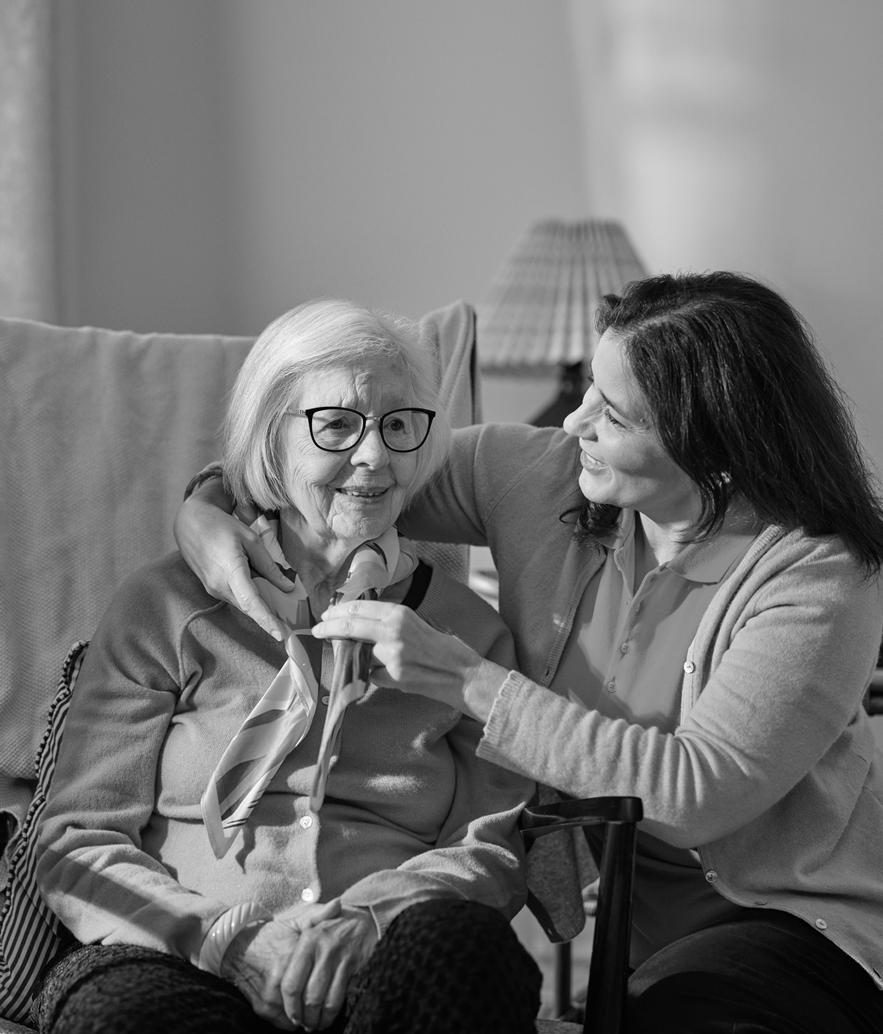
As UX & UI designer, I was responsible for defining the digital experience across six markets, ensuring the new brand launch was not only visually consistent but also user-friendly and accessible for caregivers, families, and elderly clients.When Home Instead rebranded to Dovida, the organization needed more than a new name. They needed a digital platform that could scale across six countries while supporting very different user groups:
The challenge was to unify fragmented websites into one digital ecosystem while creating an intuitive, trustworthy experience for all audiences.
I mapped the core journeys for each user group and facilitated workshops with internal stakeholders. Pain points such as complex flows, duplicated content, and accessibility gaps that excluded elderly users became clear.
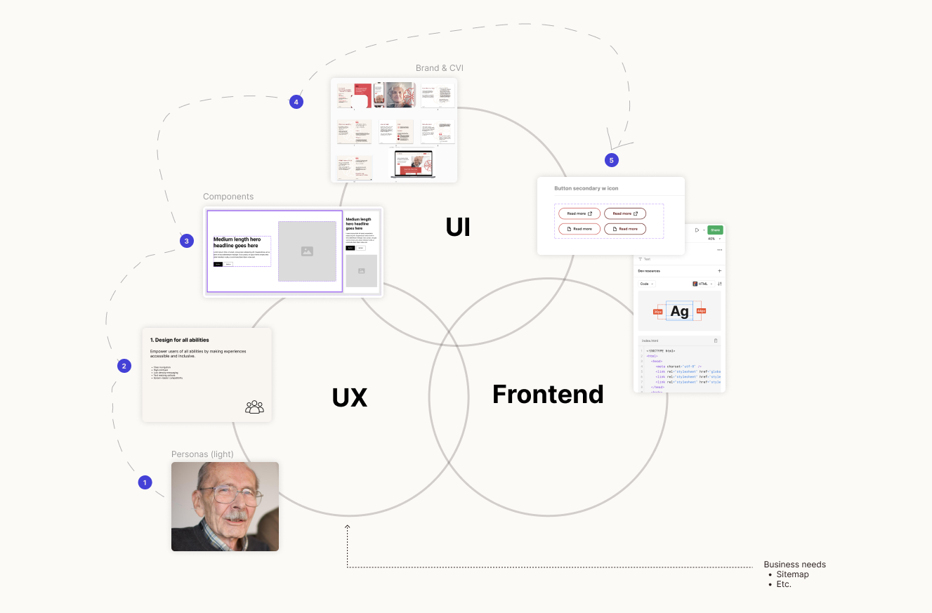
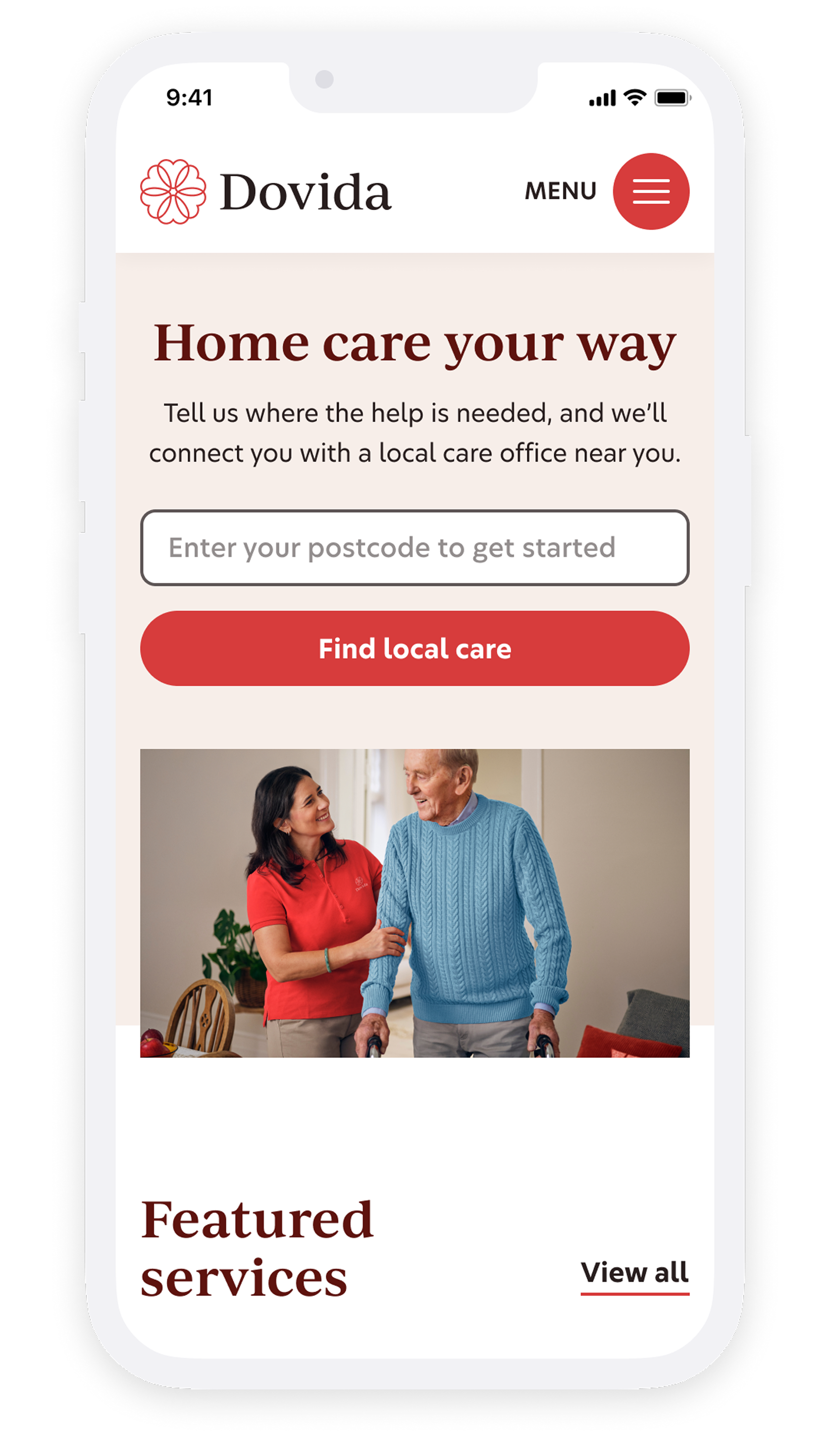
Using sitemaps, wireframes, and interactive prototypes, I streamlined navigation and simplified key flows:
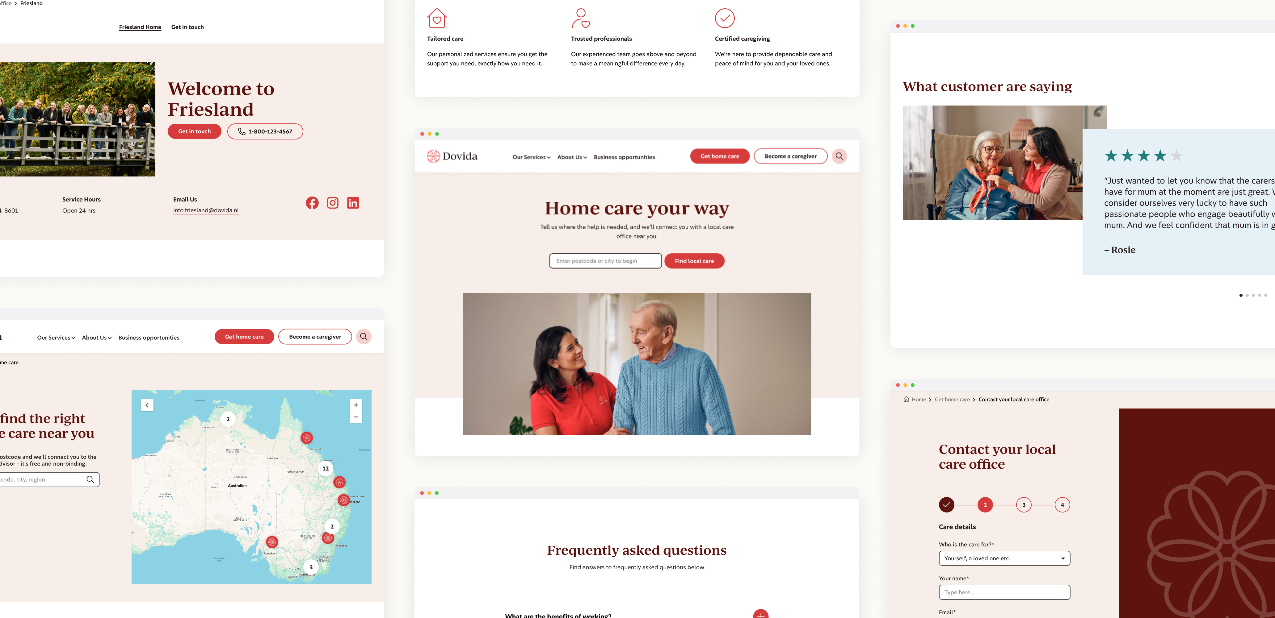
I Helped built a modular design system that enabled scalability across six markets. The system defined rules for color, typography, imagery, and components – giving local teams flexibility while ensuring brand consistency. The visual language balanced warmth and trust with usability and clarity.

The collaboration has been excellent. So what I really like is the energy that the team brings and no matter what the issue was or the problem, I always felt the team tried to understand us and went that extra mile.
UX designer
Rikke Korup Sørensen